Traffic, But No Sales? 10 Steps To Boost Your Sales
Getting traffic, no sales? I’ve gotten an average of 50-80 visitors per day, but there are no new orders. What happened to my store? It might be the most common problem that many e-commerce store owners complaining about. Everything happens for a reason, there is one thing to be certain, any information about your store that customers can access requires to be set up carefully, even the smallest details, which may cause the loss of a potential customer.
So how to recheck and set up your store to fix the problem, we offer 10 steps to help you deal with it.

1. Find Your Winning Products
Put things right once and for all will never work well for finding perfect niches, even if you are lucky enough to find an explosive product which brings you a continuous flow of traffic and revenue, in the long run, it’s most likely a flash in the pan, because the market varies from minute to minute. Of course, for a startup entrepreneur, this situation is almost impossible. Finding winning products is a continuous and vital procedure in the long-term process of dropshipping. When your store has traffic but no sales, you should start self-inspection from the product inspection. Although we always claim that be confident with your products, in some cases, to avoid wasting too much self-confidence on the wrong products is also very important.
Ask yourself about your products:
- If it could solve a certain issue what are many people facing?
- Has the product’s market share been saturated?
- Does it cater to the trend?
- Is the quality and price of it reasonable?
It’s well known, the premise of a niche with market demand is to be able to solve the current problems. After this problem settles down, next point you have to consider is how’s the competitiveness of your products, if there are many stores, including some top Shopify stores are selling the same products like yours, they are likely to seize the opportunities, has taken the lead in most of the market share, you'll find it hard to stand out from the competitors. If you think that you may not have enough advantages in marketing, then I recommend you focus on selecting the next niche for your store.
After we are sure there is enough room for your products to make a splash, you have to consider, especially when you are going to build an explosive product, this is, even more, a question for you to think, does this product meet the trend? Or, in other words, whether it can guide the trend. The correct prediction of the market is crucial to your success.

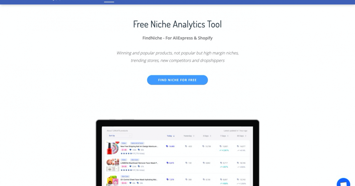
Generally, you get what you pay for. The cost-effectiveness performance of this product is also one of the factors you should take into account. If a product that doesn’t seem to have a very good selling point or quality and it matches a higher price, would you buy it? If you don’t have any clue about finding winning products, niche analytic tools like Ecomhunt, FindNiche, Dropshipspy will give you some inspiration.
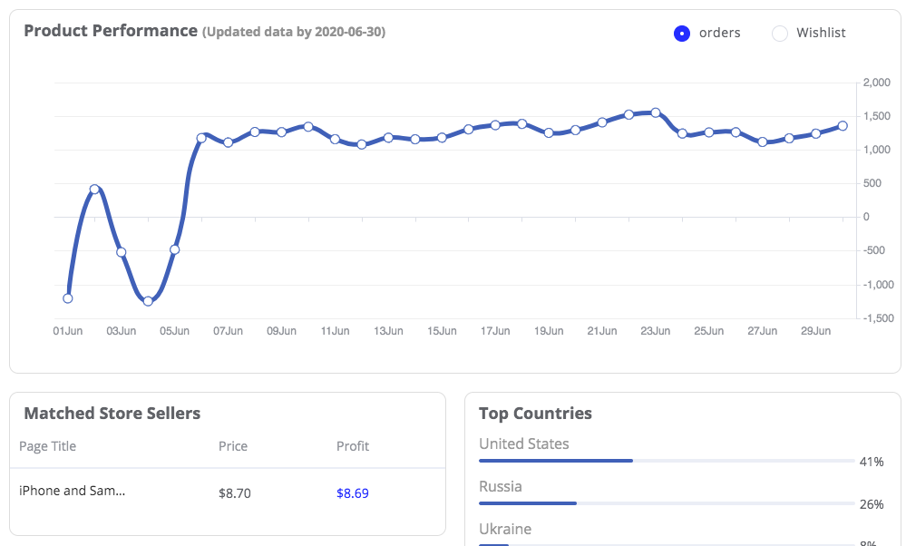
Take cellphone&telecommunications classification as the case example, as the figure (provided by FindNiche) shown below, this product “screen protector” belongs to the subdivision "mobile phone accessories” field, and it is the product with the most orders in this category in the past 7 days, it also belongs to the top brand with low competitiveness.
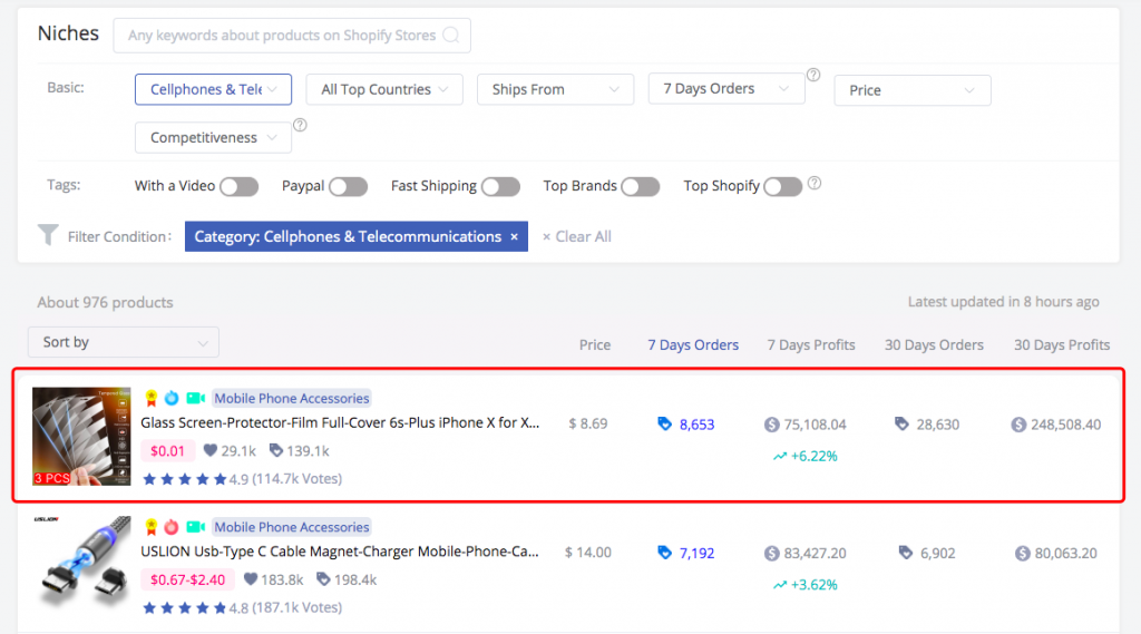
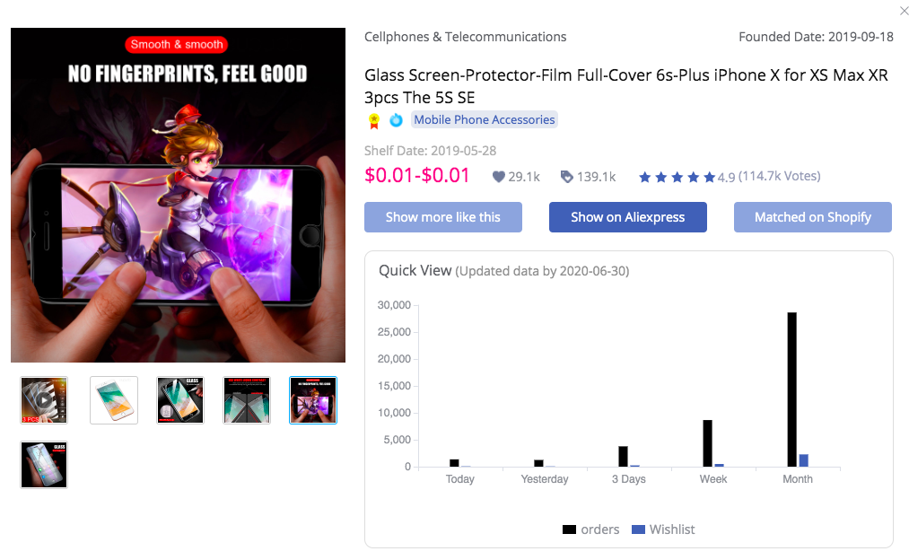
It covers more information: the orders of it are much higher than wishlist since this month, and the order volume is maintained at a relatively high level, this product which predicted to have a better performance in the future period of time.
Therefore, when you find that your product cannot bring your store any sales, you have to reconsider if it is your winning product, if it’s not, change it right now.
2. Sufficient Product Information
Whether users can understand the product clearly through the product's description? This is where you have to spend a lot of time to figure out.
Check the example of the product’s description below.
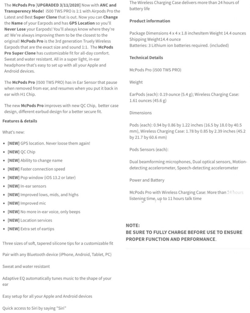
It did literally covered a lot of information about this wireless earphone product than many other stores, but is it enough? In terms of words description, it is indeed enough, however, for customers, it will cause visual fatigue. If these powerful features are presented in the form of video, it will attract more favorable impressions. Even if your products are well enough, it doesn’t mean that visitors will buy any of them, persuading them is your duty.
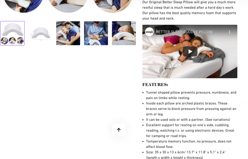
As the examples are shown above, video descriptions with high-resolution images and clear explanations will stimulate people’s purchase desire.
But this description is still not the best, if your traffic is visiting your product pages but not checking out, then you really need to work on your product descriptions, you’d better not rely on AliExpress for that one, general common used instructions will send your customers to your competitors’ store, a perfect description is best written by yourself, trying to write something unique and interesting to grab your customers’ eyes for your products.
3. Attractive Homepage Design
The homepage of your store is like the display window of a physical store, it requires a bright brand design that will attract customers at first glance while encouraging them to enter and start shopping. Just navigate your store like a new customer, what would make you stay?
Strong visual banner identity
Banner takes center stage of homepage where people can see at a glance when people enter your store, it sends the first message containing a single clear and precise information of your store that delivers directly to your store’s target audience, convincing them to spend more time on your website. The banner must be built with a strong visual identity with consistent colors and fonts, consistency will make your store more like a top brand store.
Also, you have to make sure the images you choose are high quality and clear, the image is not necessarily the picture of your products, but it has to be closely related to your product, if you sell sun hats, then an outdoor scene with sunlight can be used as your banner material. If your own homepage doesn’t have a charming banner image, or if it contains too many competing messages, you could be confusing customers and missing them as a consequence.
One of the perfect banners example presented below:
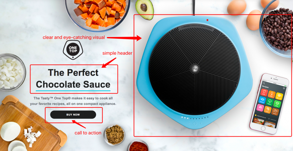
It’s a simple but clear banner that you could learn from:
- Strong visual brand identity
- High-quality image
- Simple message easy to read
- Call to action button
Take full advantage of announcement bar
Announcement bars usually appear at the very top of the website page with small text, containing a short message like the professional slogan, free shipping or a time-limited discount for certain items, it’s the best place to inspire customers shop right now.
You can clearly know what this store might sell from the short text on the announcement bar: hurry up and make yourself beautiful.
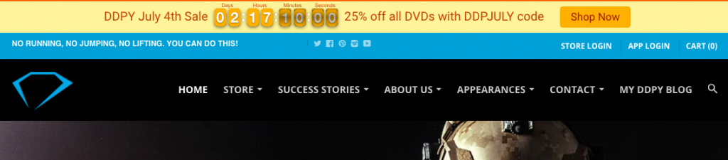
This store set countdown timer on their announcement bar, it produces a sense of urgency, after seeing the timer, impulsive customers, especially for those price-conscious customers, might feel the intense need of the product, they may buy it right now, but for those shoppers who are not in great demand, it won’t work that well.

Free shipping can also increase the user's desire to purchase. There is an interesting phenomenon: customers prefer to buy items with $58 including shipping costs instead of buying products that cost $45 but require a $10 shipping fee.
Integrating special promotions like I’ve mentioned above into the top place of your homepage through an announcement bar may help you increase your sales.
Build logic and intuitive navigation menus
In most cases, navigation is generally displayed at the top (the header navigation), sometimes on the side, and the bottom (the footer navigation) of your store’s homepage and each menu is linked to other pages of the store. The navigation settings should allow customers to find your products, get store information, and get in touch with you.
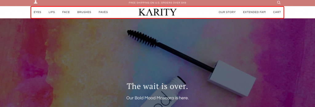
Depending on your business, header navigation menus are different, but it often features:
- Products, which usually leads to a collection page containing all of the products or a menu to sort products into different catalogs.
- About us, it’s something about your founder story that customers may want to know
- Contact us, if customers have any problems or concerns, they could contact you right away
- FAQ, it collects the answers of some of the most common questions that customers might have about your products
- Shipping, it contains the average logistics time, destination country, and shipping cost
These are very basic information, the main navigation settings could help you build customers' trust quickly. Common problems are the issues that most users will encounter, collect them in order so that customers would have a feeling of being experienced, meanwhile, logistics timeliness is also very important, especially for some gifts or holiday decoration items, after all, no one wants to receive Christmas decoration tree after Christmas Day.
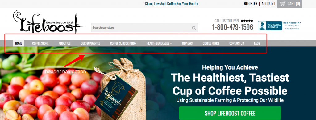
Take Lifeboostcoffee store as an example, its navigation menu includes a lot of information, the returns information in OUR GUARANTEE, and then the FAQS contains a lot of common questions (including logistics time limit), such as the origin of the coffee, how much each pack weighs, can the coffee beans be stored in the refrigerator, shipping destination, and shipping policy…… it looks like a well-established top Shopify store, it doesn't make me feel any wrong, but actually I think it is not that creative, it doesn’t catch my feeling, in other words, I’m not touched.
Now, look at this one, it’s a little story displayed in “About Us":
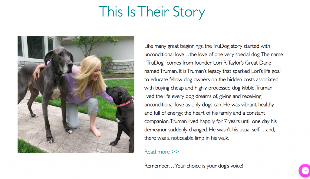
After finish reading, how you feel? Does Truman’s story remind you of your lovely puppy? This is one of the top Shopify niche stores that selling dog’s nutrition, in fact, the competition of dog food is fierce, but this store can operate so successfully, the main reason is that they really touch us with some touching stories, which you can learn from.
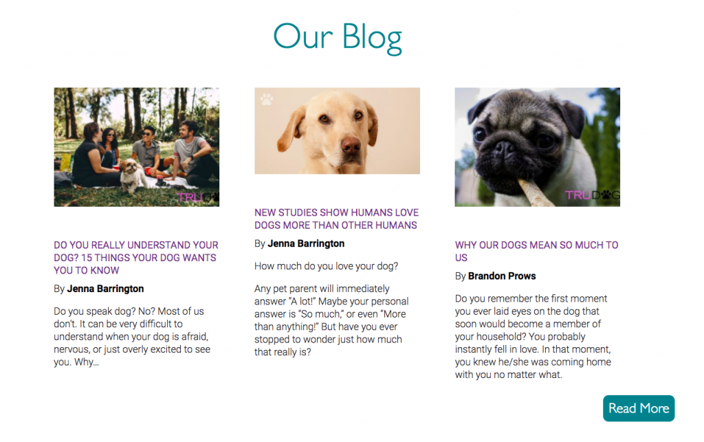
Besides, they also have blog and club links on their navigation menus, which deepened communication, and even if you don’t buy anything this time, you can also join their club and listen to their lovely touching puppy stories, that’s how they build trust.
Of course, the navigation page varies from product to product. If you have a blog and a club, add it and open a window where customers know more about you.
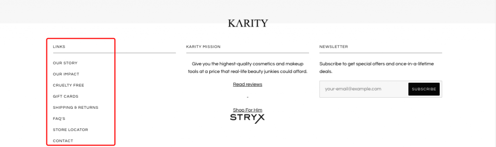
The links found in footer navigation menus are a little bit different than those found in the header, it links to secondary information, such as refunds, privacy, and terms&conditions.
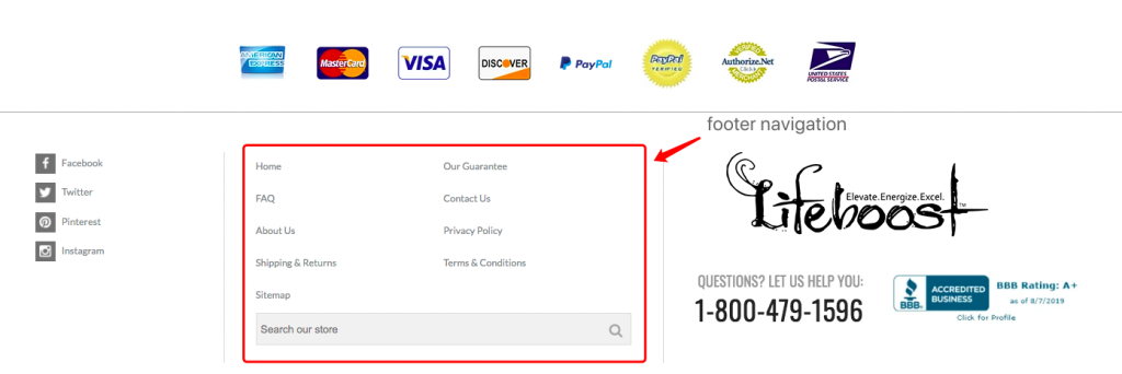
Make sure both your header and footer links are working correctly, test them if the text matches the page it links to, also check if it works well on the mobile phone, anyway, an incorrect or a broken link could causing the loss of your sales.
Highlight at least one product on your homepage
Whether it is a general store or a niche store, highlight at least one product on your homepage is very essential, perhaps there are hundreds of products selling on your store, you’d better choose several of them to attract shoppers attention, if you display too many products, it will be dazzling and hurt your sales as a result.
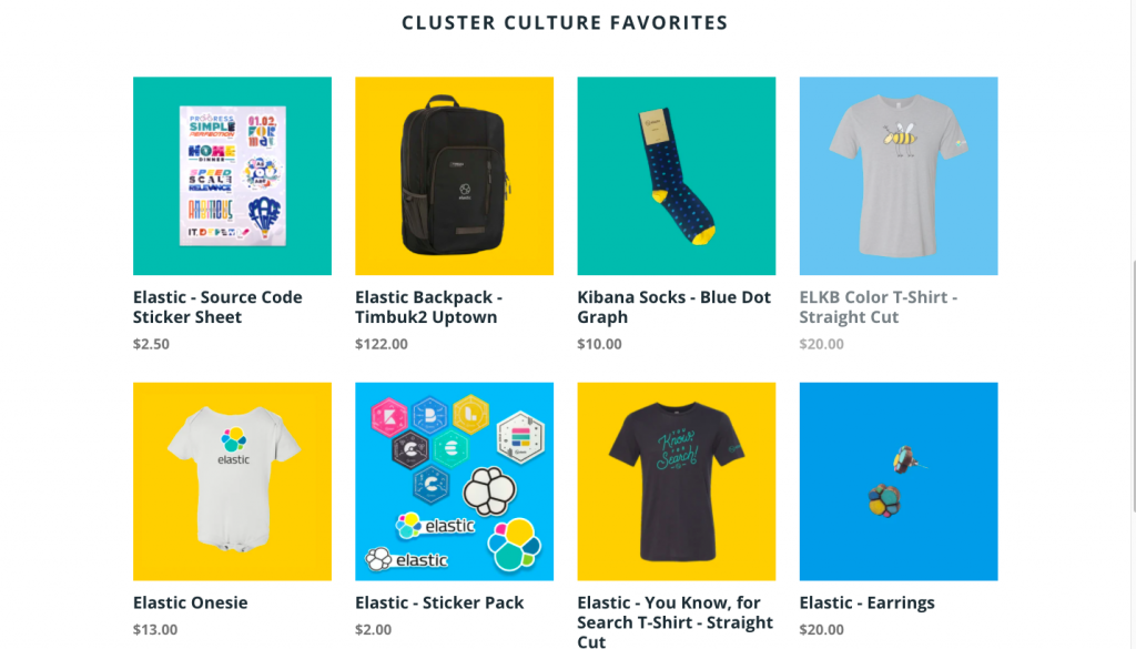
You can refer to the homepage settings of some top Shopify stores, and then find the best ways of presenting your products.
It’s a general store listed below, and it promotes the “cluster culture favorites” catalog to customers.
This is a product that is specially launched on the homepage of one of the general stores. Normally, this product will be updated every certain time. If a certain holiday is approaching, then this store will list holiday-related products on the homepage.
Above is a one-product store, the homepage design of which is simple and beautiful. It fully displays the advantages of this product in the form of graphics and videos. When you browse its homepage, you can clearly understand the characteristics of this product.
All the suggestions mentioned above are not the only way to optimize your homepage when you build your own one, it’s better to start from a user’s perspective to ask yourself about any details: are the image crisp and compelling? Is it easy to understand? Are buttons easy to use?…… Create a logical and intuitive page structure, besides, make sure your website is working well in mobile devices, make sure every link is correct and accurate.
4. Target The Right Audience (Analyze The Traffic)
How do you target ads?
On what platform?
Which audience group to choose?
Have you defined your audience too broadly? If your product tries to speak to everyone, then it speaks to no one. Or have you completely targeted the wrong consumer group? Obviously, under normal circumstances, you don't sell combs to bald people, do you? But, again, wigs might in demand in this group. For the products you sell, you need to locate a consumer group more accurately(or narrow down the positioning), that is, establish a buyer's profile, including age, hobbies, occupation…… and perform some A/B tests (for example, using Facebook Ads), which can help you target the right audience and increase sales in the process.
There are many quick ways to find your target audience, I’ll show you one of them. Going after other success stories is basically error-free, viewing other stores(could be your competitors’ store) that are similar to you, you may have the common audience, check their target countries(provided by FindNiche), then check how they deliver their ads on the social platform, just follow them then you’ll find yours.
Besides, there are a variety of tools that would help you better understand your audience and increase conversion rates, for example, Google Analytics can be used to investigate which step of the sales losing, you have to test and recheck every change then.
5. Keep Page Timings Working well
It’s a good way to promote online stores through various approaches, in most cases, promotion can increase brand awareness while driving some new traffic to your store, the purpose of the promotion is to convert newcomers into loyal customers. If the page timing is higher than 3-5 seconds, you’re losing money. Especially in some busy shopping days, such as Black Friday, you can’t even imagine how many sales you will lose because of this” not that important” problem. You can check the average page load time through Google Analytics, If the speed is too slow, which giving the customers very bad user experience, then the user's churn rate will be relatively large.
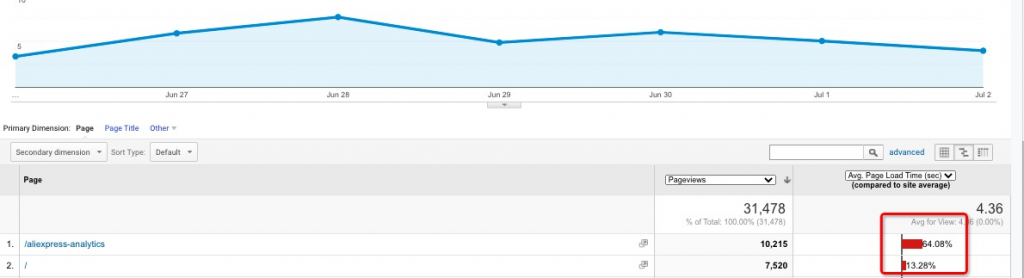
Look at the example offered by FindNiche above, the loading time of “AliExpress-analytics” is abnormal, If you also encounter such a situation, adjust as soon as possible, otherwise, you will lose some of your customers.
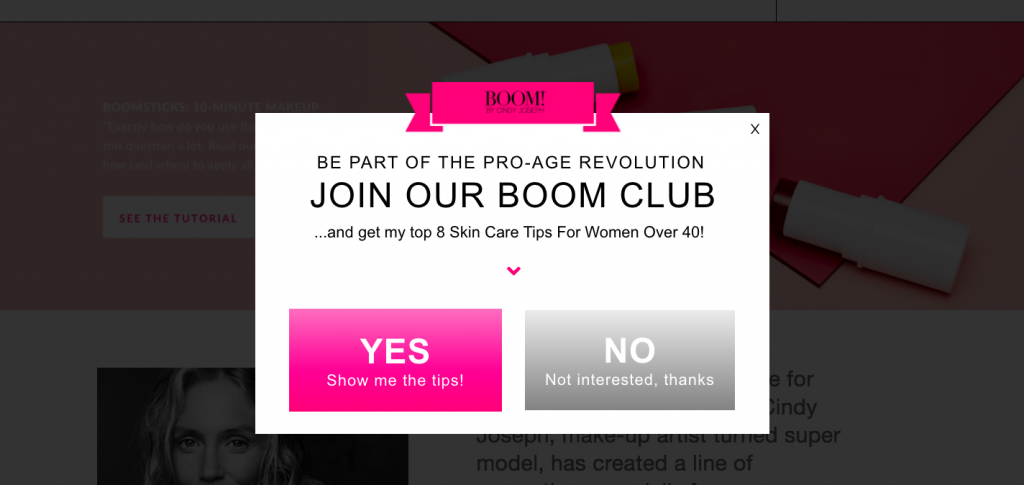
6. Appropriate Advertising And Pop-ups
No one likes the ads that keep popping up, but almost all vendors like users who subscribe for free. Imagining what happens when 3-6 pop-up windows are displayed in 2 or 3 minutes, a little “bothersome”, right? Keep your pop-up window remain flat, otherwise, visitors will be distracted to purchase and there is a risk of losing sales. Additionally, showing too many ads on your store can also affect conversions negatively. Keep simple and make the customer comfortable.
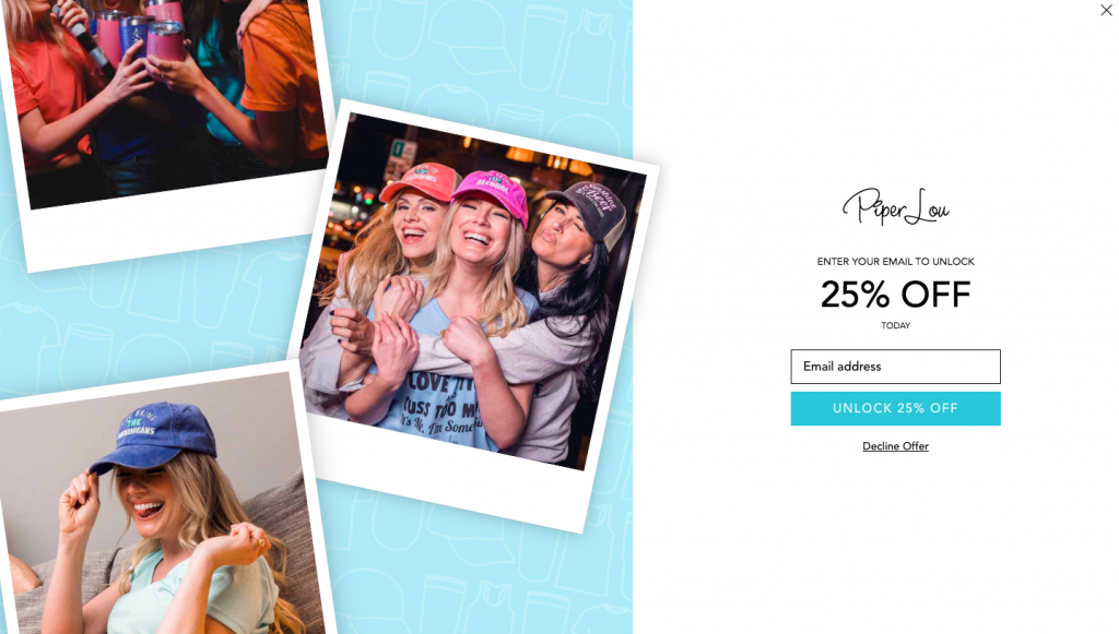
7. Tips To Collect Emails
Pop-up windows that I mentioned above are good ways to collect emails while reminding visitors to subscribe, when the customer visits your store, and fill in the e-mail message, indicating that the customer is a relatively accurate customer. Then you can do email marketing, send these potential customers individual coupons or special offers. Meanwhile, showing some discounts will increase the chance of converting new visitors into customers. “Piper Lou” does this well: they offer a 25% discount code in exchange for an email address.
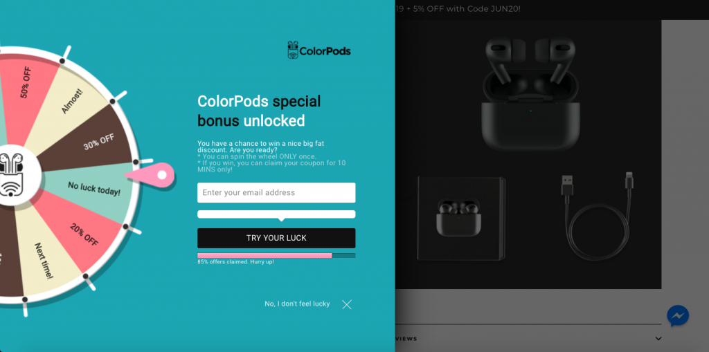
“Colorpods" does this interesting: You can get a certain discount in exchange for your email address, but they design a few tricks to prevent you from knowing a certain discount, it is easier to arouse people's curiosity: what my luck worth? It’s a great way to try.
8.Improving the shopping cart
Here are several steps you can follow:
Allow to checkout as a guest
Show supported payment methods
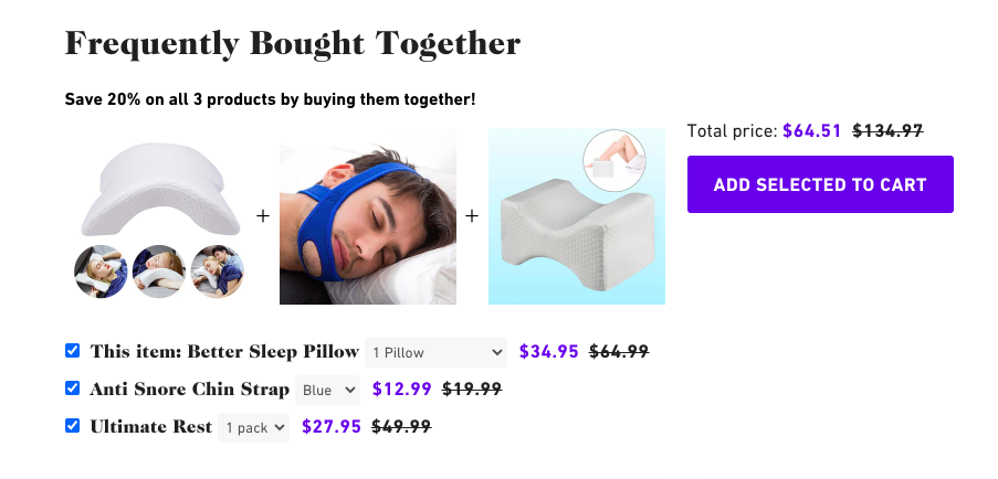
Add related suggestions (as is shown in the image below)
Show a progress bar to indicate checkout steps
Keep the interface brief
Allow changing the number of ordered items
Offer new customers a first-purchase discount code
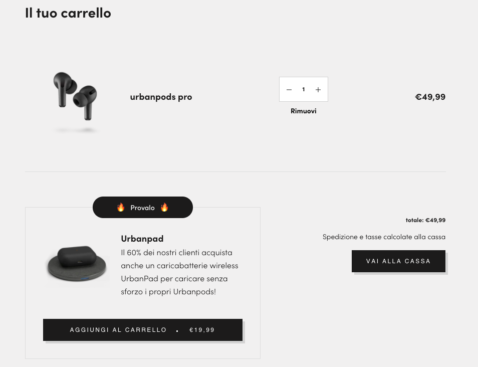
Besides, there are some tips you might try, for example, add some elements that make shoppers feel more urgent purchase now, such as limited quantity, big fat time-limited discount, and combined proposals, when customers increase the number of purchases, they can fairly intuitively see the changes in fees.
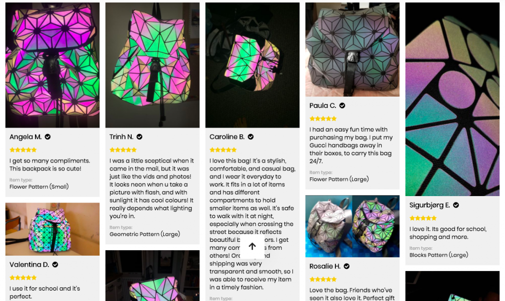
9. Optimize Reviews By Customers
I'm sure that 90% of people are willing to buy products recommended by others, which could explain why influencers marketing brings such good economic benefits. So, if I am a customer who intends to buy pods pro, now I see two shops selling the same product, their products are similar, and the prices are not much different. Which one would you choose?
The first one:
The second one:
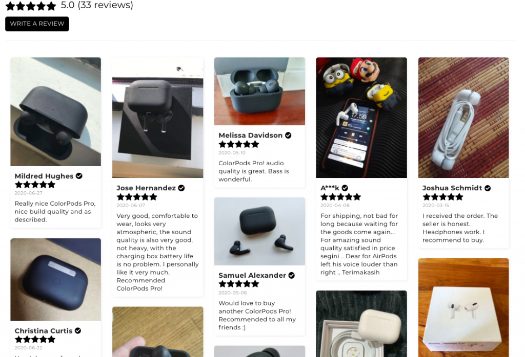
Obviously, I will definitely choose the second one, because there are many reviews with real pictures that were taken by other customers who already bought this.
In fact, I found these two stores through FindNiche. Their products are from the same supplier, and it can even be said to be identical. Imagine that when you are selecting products, if there are two suppliers who supply the same type of products and the function and price are not much different, are you more inclined to buy the one with real user reviews, because it looks real? To be honest, if not all are bad reviews such as vomiting quality, but the positive comments are mixed with some "long logistics time" and “wrong colors", these are literally more authentic than Shops that are well-regarded and is more likely to create a sense of trust. When people already have a strong demand to buy this product, and then compare those stores. If you happen to have a user's comment that can poke the user's heart, then this order is yours.
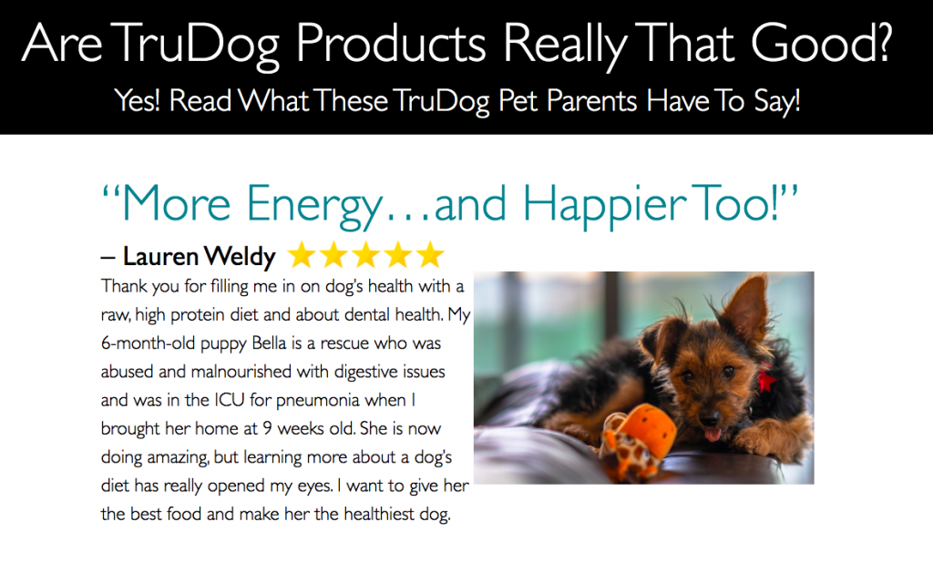
Then take a look at how this niche store does, they set review area in “About Us”, these comments are “well-designed”, that is to say, touching words with cute images are easy to stimulate one’s emotions, and then it makes you feel a strong purchase demand.
While waiting for customers to comment on this product, using some tips to active customers to comment, for example, sending an email to the user, sincerely invite her to comment on your products and related services, additionally, you can also give certain preferential policies, rebate, or give a discount for the next purchase within a certain period.
Who doesn’t love beautiful things? If the pictures in your review area are better, it can also stimulate the user's desire to buy, that’s what you need to coordinate or encourage with the user. For example, you can set a like button in the review area of a specific product, then set a deadline, and users who get the most like comments in this period would get some special prizes, such as medals, small pillows with logos as a prize.
10. Build Customer Trust
We’ve talked enough about how to build user trust in this article, here I am going to add several effective points:
Chat with customers live
It’s a useful way to build a one-on-one connection with every visitor who comes to your store, and this function can be added through apps like Shopify Chat, or through Facebook Messenger. It's worth using live chat and chatbots for your online store because they are easy to access, efficient, and allow you to solve problems in time, and they respond to various events based on visitors' behavior, for example, interacting with shoppers who abandoned their carts, then sending out a discount code to them, your customers can also switch to real-time operators at any time as needed.
Use social media to build strong relationships
Social media accounts are a very essential component of a brand’s presence. Before they make any purchase, they may visit your Instagram, Facebook…… They might check out your brand’s social profiles in their decision-making process.
There is one thing we should make it clear that not all visitors are going to make a purchase on their first visit, they might require multiple trips back to your store before they make up their mind, but don't release false promises for sales to induce the purchase.
Above are some effective strategies to investigate why your store has traffic but no sales, hope it helps to your e-commerce business.